![WordPress网站&子比主题模板美化教程【备忘录】汇总篇 [27]-Baili Blog](https://cdn.bailir.top/wp-content/uploads/img/2024/08/20260805112759680.png)



前言
本篇主题美化的各种内容教程,是在白黎博客上测试过,实际使用无误后的记录合集,使用之前可以先参考本站,若觉得实用好看的就拿去用吧,本文会持续的整理更新。
更新说明:
本篇可能更新不及时,可前往主题美化栏目来查看本站所有的美化效果!
主题美化说明:
- 对网站的主题美化、小工具可能会有一定程度,致使网站加载缓慢、CSS 全局污染等等一系列的问题,请一定要测试无误后在进行美化。
- 随着主题美化不断增多,可能会对主题的相关文件进行修改,因此在更新主题前,请及时备份主题美化的文件,或者收藏本站,在本站可以及时找回,以免一些主题页面或美化效果丢失。
必要代码使用说明:(重点)
- 新手请注意,不会添加代码的看下面。有代码基础的,可以忽略。
- CSS 代码添加到后台:子比主题设置—>自定义代码—>自定义 CSS 样式
- JS 即 javascript 代码添加到:后台子比主题设置—>自定义代码—>自定义 javascript 代码
- 添加小工具没有特殊说明的,自定义 HTML 小工具:添加网站后台—>外观–>小工具–>点击【自定义 HTML】选择放置的位置—>把代码复制进去,保存即可。
- 还有一些其他的代码教程添加方式的,我会在教程里告知,若只需添加 CSS+JS 的教程,我可能不重复告知了,请注意看上面的方法。
- 有些美化教程本站之前已经有发布的,本文章将不再进行编写教程,直接会跳转到对应的文章页面查看教程即可。
主题美化清单
使用方法:
将下放的css代码,复制 CSS 代码到后台子比主题设置—》自定义 CSS 样式—》将 CSS 代码粘贴框里,即可大功告成。
自定义 CSS 代码:
/*文章随机彩色标签开始*//*by:大雄搜集站-soujiz.com*/.article-tags{margin-bottom: 10px}.article-tags a{padding: 4px 10px;background-color: #19B5FE;color: white;font-size: 12px;line-height: 16px;font-weight: 400;margin: 0 5px 5px 0;border-radius: 2px;display: inline-block}.article-tags a:nth-child(5n){background-color: #4A4A4A;color: #FFF}.article-tags a:nth-child(5n+1){background-color: #ff5e5c;color: #FFF}.article-tags a:nth-child(5n+2){background-color: #ffbb50;color: #FFF}.article-tags a:nth-child(5n+3){background-color: #1ac756;color: #FFF}.article-tags a:nth-child(5n+4){background-color: #19B5FE;color: #FFF}.article-tags a:hover{background-color: #1B1B1B;color: #FFF}/*by:大雄搜集站-soujiz.com*//*文章随机彩色标签结束*/使用方法:
将下放的css代码,复制 CSS 代码到后台子比主题设置—》自定义 CSS 样式—》将 CSS 代码粘贴框里,即可大功告成。
/*导航栏字体加粗开始*//*by:大雄搜集站-soujiz.com*/ul.nav {font-weight: 700;}/*by:大雄搜集站-soujiz.com*//*导航栏字体加粗结束*/使用方法:
将下放的css代码,复制 CSS 代码到后台子比主题设置—》自定义 CSS 样式—》将 CSS 代码粘贴框里,即可大功告成。
/*头像呼吸光环和鼠标悬停旋转放大开始*/
/*by:大雄搜集站-soujiz.com*/
.avatar{border-radius: 50%; animation: light 4s ease-in-out infinite; transition: 0.5s;}.avatar:hover{transform: scale(1.15) rotate(720deg);}@keyframes light{0%{box-shadow: 0 0 4px #f00;} 25%{box-shadow: 0 0 16px #0f0;} 50%{box-shadow: 0 0 4px #00f;} 75%{box-shadow: 0 0 16px #0f0;} 100%{box-shadow: 0 0 4px #f00;}}
/*by:大雄搜集站-soujiz.com*/
/*头像呼吸光环和鼠标悬停旋转放大结束*/1、首先在子比主题目录的functions.php里面加入以下代码:
//微语 BY:白黎博客
add_action('init', 'my_custom_init'); function my_custom_init() { $labels = array( 'name' => '微语', 'singular_name' => 'singularname', 'add_new' => '发表微语', 'add_new_item' => '发表微语', 'edit_item' => '编辑微语', 'new_item' => '新微语', 'view_item' => '查看微语', 'search_items' => '搜索微语', 'not_found' => '暂无微语', 'not_found_in_trash' => '没有已遗弃的微语', 'parent_item_colon' => '', 'menu_name' => '微语' ); $args = array( 'labels' => $labels, 'public' => true, 'publicly_queryable' => true, 'show_ui' => true, 'show_in_menu' => true, 'query_var' => true, 'rewrite' => true, 'capability_type' => 'post', 'has_archive' => true, 'hierarchical' => false, 'menu_position' => null, 'supports' => array('title','editor','author') ); register_post_type('shuoshuo',$args); }
2、然后在子比主题pages目录下新建一个weiyu.php文件,然后把下面代码放入weiyu.php文件中即可。
<?php

/**
 * Template name: 微语页面
 * Description:   weiyu
 */

// 获取链接列表 BY:白黎博客
get_header();
$header_style = zib_get_page_header_style();
?>
<main class="container">
    <div class="content-wrap">
        <div class="content-layout">
            <?php while (have_posts()) : the_post(); ?>
                <?php if ($header_style != 1) {
                    echo zib_get_page_header();
                } ?>
                <?php endwhile;  ?>
                <div class="box-body theme-box radius8 main-bg main-shadow">
                    <?php if ($header_style == 1) {
                        echo zib_get_page_header();
                    } ?>
                <!--主体开始-->
                <style type="text/css">
                #shuoshuo_content{padding: 10px; /*min-height: 500px;*/} /* shuo */ body.theme-dark .cbp_tmtimeline::before{background: RGBA(255, 255, 255, 0.06);} ul.cbp_tmtimeline{padding: 0;} div class.cdp_tmlabel > li .cbp_tmlabel{margin-bottom: 0;} .cbp_tmtimeline{margin: 30px 0 0 0; padding: 0; list-style: none; position: relative;} /* The line */ .cbp_tmtimeline:before{/*content: '';*/ position: absolute; top: 0; bottom: 0; width: 4px; background: RGBA(0, 0, 0, 0.02); left: 80px; margin-left: 10px;} /* The date/time */ .cbp_tmtimeline > li .cbp_tmtime{display: block; /* width: 29%; */ /* padding-right: 110px; */ max-width: 70px; position: absolute;} .cbp_tmtimeline > li .cbp_tmtime span{display: block; text-align: right;} .cbp_tmtimeline > li .cbp_tmtime span:first-child{font-size: 0.9em; color: #bdd0db;} .cbp_tmtimeline > li .cbp_tmtime span:last-child{font-size: 1.2em; color: #9BCD9B;} .cbp_tmtimeline > li:nth-child(odd) .cbp_tmtime span:last-child{color: RGBA(255, 125, 73, 0.75);} div.cbp_tmlabel > p{margin-bottom: 0;} /* Right content */ .cbp_tmtimeline > li .cbp_tmlabel{margin: 0 0 45px 65px; background: #9BCD9B; color: #fff; padding: .8em 1.2em .4em 1.2em; /* font-size: 1.2em; */ font-weight: 300; line-height: 1.4; position: relative; border-radius: 5px; transition: all 0.3s ease 0s; box-shadow: 0 1px 2px rgba(0, 0, 0, 0.15); cursor: pointer; display: block;} .cbp_tmlabel:hover{transform:scale(1.05); transform: translateY(-3px); z-index: 1; -webkit-box-shadow: 0 15px 32px rgba(0, 0, 0, 0.15) !important} .cbp_tmtimeline > li:nth-child(odd) .cbp_tmlabel{background: RGBA(255, 125, 73, 0.75);} /* The triangle */ .cbp_tmtimeline > li .cbp_tmlabel:after{right: 100%; border: solid transparent; content: " "; height: 0; width: 0; position: absolute; pointer-events: none; border-right-color: #9BCD9B; border-width: 10px; top: 4px;} .cbp_tmtimeline > li:nth-child(odd) .cbp_tmlabel:after{border-right-color: RGBA(255, 125, 73, 0.75);} p.shuoshuo_time{margin-top: 10px; border-top: 1px dashed #fff; padding-top: 5px;} /* Media */ @media screen and (max-width: 65.375em){.cbp_tmtimeline > li .cbp_tmtime span:last-child{font-size: 1.2em;} } .shuoshuo_author_img img{border: 1px solid #ddd; padding: 2px; float: left; border-radius: 64px; transition: all 1.0s;} .avatar{-webkit-border-radius: 100% !important; -moz-border-radius: 100% !important; box-shadow: inset 0 -1px 0 #3333sf; -webkit-box-shadow: inset 0 -1px 0 #3333sf; -webkit-transition: 0.4s; -webkit-transition: -webkit-transform 0.4s ease-out; transition: transform 0.4s ease-out; -moz-transition: -moz-transform 0.4s ease-out;} .zhuan{transform: rotateZ(720deg); -webkit-transform: rotateZ(720deg); -moz-transform: rotateZ(720deg);}
                </style>
                </head>
                <body>
                <div id="primary" class="content-area" style="">
                    <main id="main" class="site-main" role="main">
                        <div id="shuoshuo_content">
                            <ul class="cbp_tmtimeline">
                                <?php query_posts("post_type=shuoshuo&post_status=publish&posts_per_page=-1");if (have_posts()) : while (have_posts()) : the_post(); ?>
                                <li> <span class="shuoshuo_author_img"><img src="https://q1.qlogo.cn/g?b=qq&nk=86512&s=640" class="avatar avatar-48" style="width:48px;height:48px"></span>
                                    <a class="cbp_tmlabel" href="javascript:void(0)">
                                        <h4><?php the_title();   ?></h4>
                                        <p><?php the_content(); ?></p>
                                        <p></p>
                                        <p class="shuoshuo_time"><i class="fa fa-clock-o"></i>
                                            <?php the_time('Y年n月j日G:i'); ?>
                                        </p>
                                    </a>
                                    <?php endwhile;endif; ?>
                                </li>
                            </ul>
                        </div>
                    </main>
                </div>
                <script type="text/javascript">
                    $(function () {
                        var oldClass = "";
                        var Obj = "";
                        $(".cbp_tmtimeline li").hover(function () {
                            Obj = $(this).children(".shuoshuo_author_img");
                            Obj = Obj.children("img");
                            oldClass = Obj.attr("class");
                            var newClass = oldClass + " zhuan";
                            Obj.attr("class", newClass);
                        }, function () {
                            Obj.attr("class", oldClass);
                        })
                    })
                </script>
                <!--主体结束-->
                </div>
                <?php comments_template('/template/comments.php', true); ?>
        </div>
    </div>
    <?php get_sidebar(); ?>
</main>
<?php
get_footer();注:微语头像只需把代码中”https://q1.qlogo.cn/g?b=qq&nk=86512&s=640″修改成自己QQ号头像或者自己图片链接即可。
3、最后在后台—>页面—>新建页面—>找到“页面属性”选择“微语页面”—>填写标题—>发布就可以啦!
发表微语
发表微语只需在后台—>微语—>发表微语,然后发表自己喜欢的微语即可。
说明:因为微语页面采用主题添加代码的方式生成的页面,主题更新后会失效,所以更新主题时请及时备份文件代码,或者关注收藏本站。好啦!子比主题添加微语页面的文章教程到这里就结束了!
![图片[1]-WordPress网站&子比主题模板美化教程【备忘录】汇总篇 [27]-Baili Blog](https://cdn.bailir.top/wp-content/uploads/img/2024/08/20260805104027188-1024x331.png)
将代码添加到版权声明栏里保存就OK了
/*版权声明开始*/
/*by:大雄搜集站-soujiz.com*/
<fieldset style=" border: 1.5px dashed #008cff; padding: 10px; border-radius: 5px; line-height: 2em;font-weight: 700;color: var(--key-color);background-color: var(--body-bg-color);">
            <legend align="center" style=" margin-bottom: -2px;width: 30%;text-align: center; background-color: #008cff; border-radius: 999px; background-image: linear-gradient(to right, #FFCC99, #FF99CC);border: 1.5px dashed #008cff;">
              版权声明
            </legend>

          <span class="btn-info btn-xs">1</span>  本站名称:<a href="https://soujiz.com" style="color: #48dbfb;text-decoration: none;">大雄搜集站</a><br>
          <span class="btn-info btn-xs">2</span> 网址:<a href="https://soujiz.com" style="color: #48dbfb;text-decoration: none;">https://soujiz.com</a>
          <br>
                           <span class="btn-info btn-xs">3</span> 本站资源大多存储在云盘,如有链接失效,请留言反馈站长更新!<br>
          <span class="btn-info btn-xs">4</span> 本站各种资源及源码软件大部分为网络搜集而来,如有侵犯版权的,请邮件与我们联系,本站将予以改正。<br>
          <span class="btn-info btn-xs">5</span> 由于网络资源有极快的复制性,付费资源一经购买 ,不以任何形式退款,购买过程中如有付费资源失效,请及时联系站长。<br>

        </fieldset>
/*版权声明结束*/
/*by:大雄搜集站-soujiz.com*/实际我认为用图片作为背景好像不太合适,当然为了个性化的网站样式,自己玩一玩还是可以的!
其实很简单,几行CSS代码即可搞定!
进入主题设置->全局&功能->自定义代码
将以下代码中的图片地址修改为你的图片地址后,保存到自定义CSS样式
/***日间主题模式 BY:白黎博客/
body {
    background-image: url("https://aaaaaa.com/aaa.jpg");/**这里改为你自己的图片地址**/
    background-position-x: center;
    background-position-y: center;
    background-repeat: no-repeat;
    background-attachment: fixed;
    background-size: cover;
}
/***夜间主题模式 BY:映凡空间-www.yfkj6.com***/
.dark-theme {
    background-position-x: center;
    background-position-y: center;
    background-repeat: no-repeat;
    background-attachment: fixed;
    background-image: url("https://aaaaaa.com/bbb.jpg");/**这里改为你自己的图片地址**/
    background-size: cover;
}
需要注意的是,网站背景图片的色调,亮度等都需要和整体颜色相互配合才能达到较好的效果,背景太花哨或者颜色不合适都只会让网站变得很丑!(静态)
二、动态背景代码,可用子比主题背景(动态)
/*动态背景代码,可用子比主题背景  开始*/
body {
    width: 100%;
    height: 100%;
    color: #4c331e;
    line-height: 1.8;
    background: url(https://001.pipixiaozhan.cn/images/2024/1/image-264.webp) top left,#fff;
    animation: bgLoop 30s linear infinite;
}
@-webkit-keyframes bgLoop {
    0% {
        background-position: 0 0
    }

    100% {
        background-position: -1366px 768px
    }
}

@keyframes bgLoop {
    0% {
        background-position: 0 0
    }

    100% {
        background-position: -1366px 768px
    }
}

@media screen and (max-width: 900px) {
    @-webkit-keyframes bgLoop {
        100% {
            background-position:-683px 384px
        }
    }

    @keyframes bgLoop {
        100% {
            background-position: -683px 384px
        }
    }
}

@-webkit-keyframes rotate {
    0% {
        -webkit-transform: rotateZ(0);
        transform: rotateZ(0)
    }

    100% {
        -webkit-transform: rotateZ(360deg);
        transform: rotateZ(360deg)
    }
}

@keyframes rotate {
    0% {
        -webkit-transform: rotateZ(0);
        transform: rotateZ(0)
    }

    100% {
        -webkit-transform: rotateZ(360deg);
        transform: rotateZ(360deg)
    }
}
/*动态背景代码,可用子比主题背景 结束*/1、在后台—》外观—》小工具—》自定义 HTML—》 粘贴代码放入即可,选择你需要放的位置,站长是放在 首页侧边栏。
<div class="gn_box">
    <h2><center><font color=#E80017>2</font><font color=#D1002E>0</font><font color=#BA0045>2</font><font color=#A3005C>2</font><font
            color=#8C0073>年</font><font color=#75008A>-</font><font color=#5E00A1>新</font><font
            color=#4700B8>年</font><font color=#3000CF>倒</font><font color=#1900E6>计</font><font color=#0200FD>时</font>
    </center></h2>
    <center>
        <div id="CountMsg" class="HotDate">
            <span id="t_d"></span>
            <span id="t_h"></span>
            <span id="t_m"></span>
            <span id="t_s"></span>
        </div>
    </center>
    <script type="text/javascript"> function getRTime() {
        var EndTime = new Date('2022/01/01 00:00:00');
        var NowTime = new Date();
        var t = EndTime.getTime() - NowTime.getTime();
        var d = Math.floor(t / 1000 / 60 / 60 / 24);
        var h = Math.floor(t / 1000 / 60 / 60 % 24);
        var m = Math.floor(t / 1000 / 60 % 60);
        var s = Math.floor(t / 1000 % 60);
        document.getElementById("t_d").innerHTML = d + " 天";
        document.getElementById("t_h").innerHTML = h + " 时";
        document.getElementById("t_m").innerHTML = m + " 分";
        document.getElementById("t_s").innerHTML = s + " 秒";
    }
    setInterval(getRTime, 1000);
    </script>
</div>
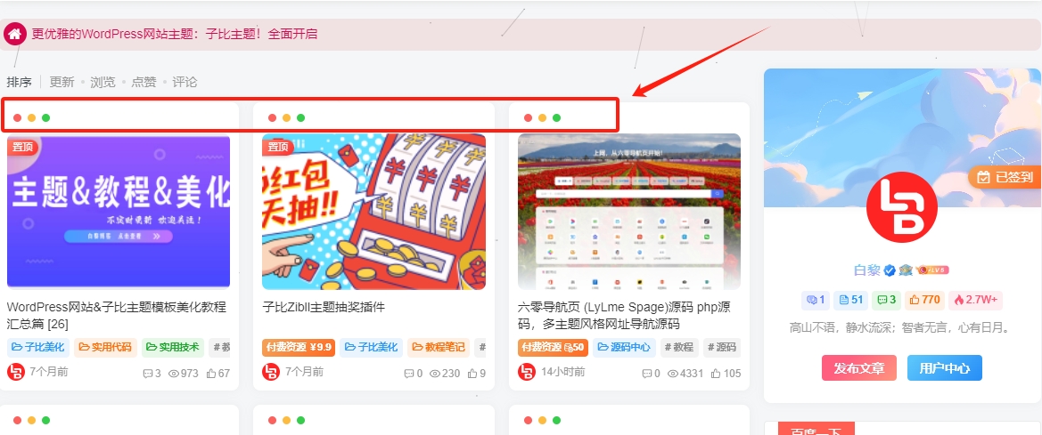
<!--侧边栏新年倒计时 by:大雄搜集站-soujiz.com*/- 前言:这个是两个小功能,鼠标移动到文章头图时会有动态效果以及首页文章列表鼠标移动悬停上浮效果
子比主题设置—>自定义代码—>自定义 CSS 样式:,添加以下 CSS 代码:
/*首页文章特色图片鼠标悬停效果开始*/
.item-thumbnail:before {content: '';position: absolute;top: 0;left: 0;right: 0;bottom: 0;background: rgba(0,0,0,0);transition: background .35s;border-radius: 8px;z-index: 2;max-width: 765px;margin: 0 auto;pointer-events:none;}
.item-thumbnail:after {content: '';position: absolute;top: 50%;left: 50%;width: 50px;height: 50px;margin: -25px 0 0 -25px;background:url(https://files.imgdb.cn/static/images/11/bf/62e2205af54cd3f9378511bf.png);background-repeat: no-repeat;background-size: 100% 100%;z-index: 3;-webkit-transform: scale(2);transform: scale(2);transition: opacity .35s,-webkit-transform .35s;transition: transform .35s,opacity .35s;transition: transform .35s,opacity .35s,-webkit-transform .35s;opacity: 0;pointer-events:none;}
.item-thumbnail:hover:before{background:rgba(0,0,0,.5)}
.item-thumbnail:hover:after{-webkit-transform:scale(1);transform:scale(1);opacity:1}
/*首页文章特色图片鼠标悬停效果结束 by soujiz.com*/
/*首页文章列表鼠标悬停3D上浮效果开始*/
.tab-content .posts-item:not(article):hover{opacity: 1;z-index: 99;border-radius: 20px;transform: translateY(-5px);box-shadow: 0 5px 10px rgba(0, 0, 0, .15);animation: index-link-active 1s cubic-bezier(0.315, 0.605, 0.375, 0.925) forwards;}
@keyframes index-link-active {
0%{transform: perspective(2000px) rotateX(0) rotateY(0) translateZ(0);}
16%{transform: perspective(2000px) rotateX(10deg) rotateY(5deg) translateZ(32px);}
100%{transform: perspective(2000px) rotateX(0) rotateY(0) translateZ(65px);}
}
/*首页文章列表悬停上浮效果结束 by soujiz.com*/使用方法:比主题设置—>自定义代码—>自定义 CSS 样式:添加以下 CSS 代码:
/*文章随机彩色标签 by soujiz.com*/
.widget-tag-cloud.fixed-width .but:hover{opacity: 1;}.widget-tag-cloud.fixed-width .but{opacity: 0.6;line-height: 20px !important;padding: 4px 10px !important;font-size: 12px !important;}.widget-tag-cloud.fixed-width .but:nth-child(5n){background-color: #4A4A4A;color: #FFF}.widget-tag-cloud.fixed-width .but:nth-child(5n+1){background-color: #ff5e5c;color: #FFF}.widget-tag-cloud.fixed-width .but:nth-child(5n+2){background-color: #ffbb50;color: #FFF}.widget-tag-cloud.fixed-width .but:nth-child(5n+3){background-color: #1ac756;color: #FFF}.widget-tag-cloud.fixed-width .but:nth-child(5n+4){background-color: #19B5FE;color: #FFF}![图片[2]-WordPress网站&子比主题模板美化教程【备忘录】汇总篇 [27]-Baili Blog](https://cdn.bailir.top/blog/2024/08/20220730160628.jpg)
使用方法:在后台—》外观—》小工具—》自定义 HTML
<div class="gn_box">
    <h2><center><font color=#E80017>2</font><font color=#D1002E>0</font><font color=#BA0045>2</font><font color=#A3005C>2</font><font
            color=#8C0073>年</font><font color=#75008A>-</font><font color=#5E00A1>新</font><font
            color=#4700B8>年</font><font color=#3000CF>倒</font><font color=#1900E6>计</font><font color=#0200FD>时</font>
    </center></h2>
    <center>
        <div id="CountMsg" class="HotDate">
            <span id="t_d"></span>
            <span id="t_h"></span>
            <span id="t_m"></span>
            <span id="t_s"></span>
        </div>
    </center>
    <script type="text/javascript"> function getRTime() {
        var EndTime = new Date('2022/01/01 00:00:00');
        var NowTime = new Date();
        var t = EndTime.getTime() - NowTime.getTime();
        var d = Math.floor(t / 1000 / 60 / 60 / 24);
        var h = Math.floor(t / 1000 / 60 / 60 % 24);
        var m = Math.floor(t / 1000 / 60 % 60);
        var s = Math.floor(t / 1000 % 60);
        document.getElementById("t_d").innerHTML = d + " 天";
        document.getElementById("t_h").innerHTML = h + " 时";
        document.getElementById("t_m").innerHTML = m + " 分";
        document.getElementById("t_s").innerHTML = s + " 秒";
    }
    setInterval(getRTime, 1000);
    </script>
</div>
<!--侧边栏新年倒计时 by 大雄搜集站 soujiz.com-->![图片[3]-WordPress网站&子比主题模板美化教程【备忘录】汇总篇 [27]-Baili Blog](https://cdn.bailir.top/blog/2024/08/20220731230112.jpg)
本站收集的资源仅供内部学习研究软件设计思想和原理使用,学习研究后请自觉删除,请勿传播,因未及时删除所造成的任何后果责任自负。
如果用于其他用途,请购买正版支持作者,谢谢!若您认为「Baili Blog」发布的内容若侵犯到您的权益,请联系站长邮箱:b71239135@gmail.com 进行删除处理。
本站资源大多存储在云盘,如发现链接失效,请联系我们,我们会第一时间更新。









请登录后查看评论内容